A Bit About Letterpress
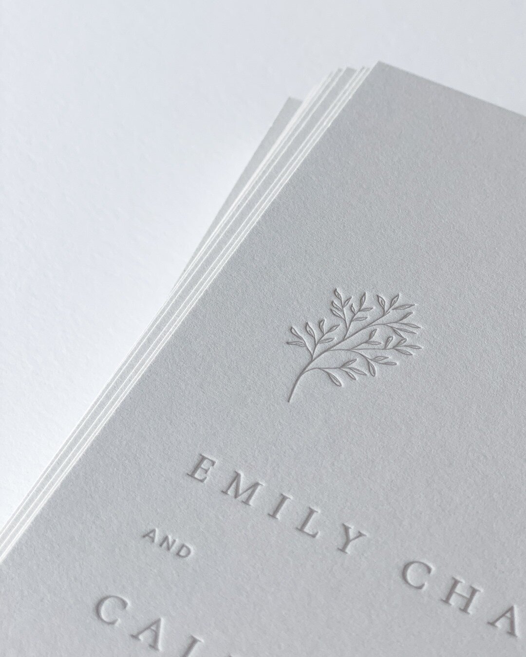
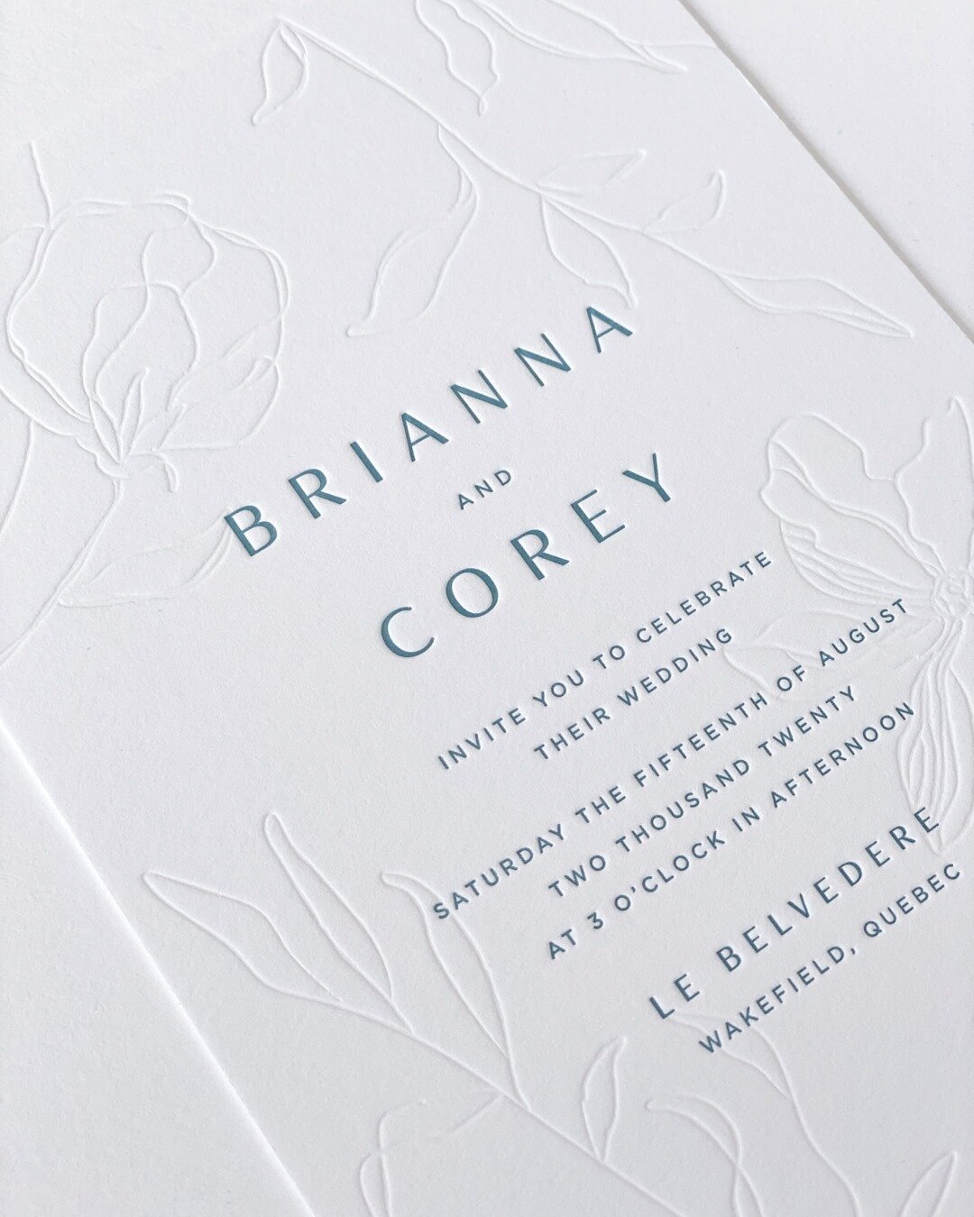
Letterpress is a centuries-old form of relief printing that has roots dating back to the 1400s. Though originally limited to hand-set wood or metal type and engravings, the advent of photopolymer plates has opened up a new set of design possibilities and brought about a resurgence of this artisanal process. Modern letterpress has become synonymous with a deep impression and tactile quality that aren’t possible through other methods of printing.
Letterpress Design Tips
Design Considerations
Number of Colours
With letterpress, each colour is printed separately one after the other. This means that each colour requires a new printing plate and another time registering and running the pieces through the press. Additional colours add to the cost of a letterpress job. Generally, letterpress pieces are one to three colours though we can certainly print more than that if your budget allows!
Inks are Transparent
The majority of inks used for letterpress are transparent. This means that the colour of the paper will affect the perceived colour of the ink. Overlapping two ink colours will result in a third colour that is a combination of the other two.
Light Inks on Dark Paper
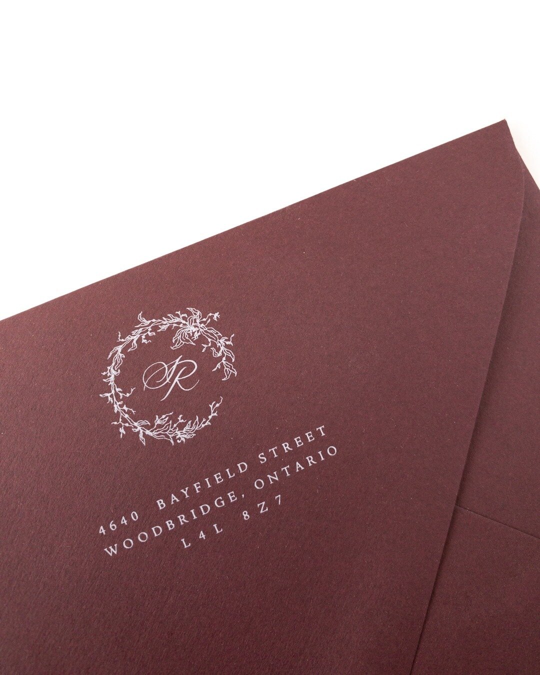
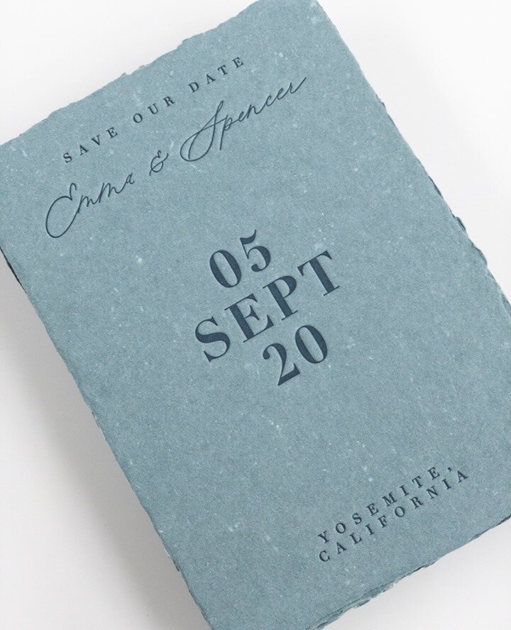
Because inks are transparent, light inks on dark paper don’t work very well. Even opaque white isn’t totally opaque and will look more like a lightish blue when printed on black paper. Often a great alternative to printing white is using a silver metallic ink which is opaque and shows up much better on dark colours. Foil also works beautifully on darker paper stocks.
Large Floods or Solid Areas
Letterpress is really great for line art and small fills, however large fills or solids can sometimes have unexpected results. Large areas of colour will have a slightly “salty” or “suede-like” appearance. The colour and coverage can also vary slightly from piece to piece. While this is part of the charm of the handmade process, if you’re looking for more solid, uniform coverage it is sometimes preferable to use a coloured paper.
Impressional depth and large coverage
For designs that have large solids or big coverage, the impression into the paper will not be as deep as with fine lines or text. Large areas or floods will look more like a kiss impression that is just sitting on the surface of the paper.
Mixing Thicks and Thins
It can be very challenging to print very fine details and large coverage areas on the same plate. Adding enough ink to get adequate coverage on the fills will over ink the thins and make them look sloppy. For designs that include both thicks and thins it may be necessary to split it onto two plates and run them through the press separately. This will add to the cost of a print job.
Minimum Line Weights
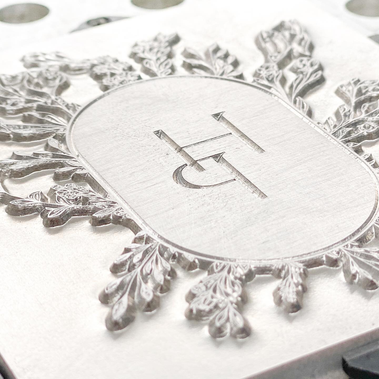
The photopolymer plates used for printing have a minimum line and dot thicknesses that will hold on the plate. Lines and dot that are too fine may wash out on the plate or break down during printing. Lines should be at least 0.25 pts and dots should be at least 1pt. When checking your artwork make sure to double check fine serifs and lines in your text and the dots on “i”s or periods.
Minimum Font Size
This is tricky and really depends on the characteristics of the typeface. A bold san serif will hold on a plate at a much smaller size than a fine serif font. What it really comes down to is the minimum line and dot weights that a plate will hold. Check to make sure the strokes of your font are at least 0.25 pts and dots on letters and periods are at least 1 pt. If your font is a little too fine you can beef it up a tiny bit by adding a very fine outline on the type.
Reverse Lines and Text
If your reversed lines and text are too fine they may fill in with ink and clog during printing. Though it depends on the type it is a good rule of thumb to keep reverse type at least 12 pts or larger. You can also add a thin stroke to your reverse text to account for ink gain.

Learn More
Tutorials & Tips
Design Tips


Not sure if your design is suited to letterpress? Email us a copy and we'd be happy to take a look!

Get inspired on instagram